WSJ Redesign
Articles are WSJ’s center of gravity. This work rebuilt the article experience as a premium storytelling system that improves readability, clarifies hierarchy, and makes room for emerging utilities without weakening editorial focus. Across app and web, the design team I led established a more cohesive framework for how stories are read, heard, shared, updated, and extended, allowing the article to scale across content types while staying unmistakably editorial at its core.
Title
Director, Product Design
Role
Led the evolution of the article experience across app and web as a core product surface.
Established principles for clarity, hierarchy, and premium storytelling.
Oversaw integration of multimedia, live coverage, related content, and subscription touchpoints within the article framework.
Directed design across multiple platforms to ensure consistent editorial expression and interaction patterns.
Partnered with Editorial, Product, Engineering, and Newsroom teams to balance storytelling needs with technical scalability.
Results
Created a more cohesive article system that can scale consistently across platforms and content types.
Strengthened editorial authority by improving hierarchy, readability, and presentation.
Built a flexible framework that better accommodates media, live updates, related content, and premium subscriber features.
Journalism First
STRATEGY
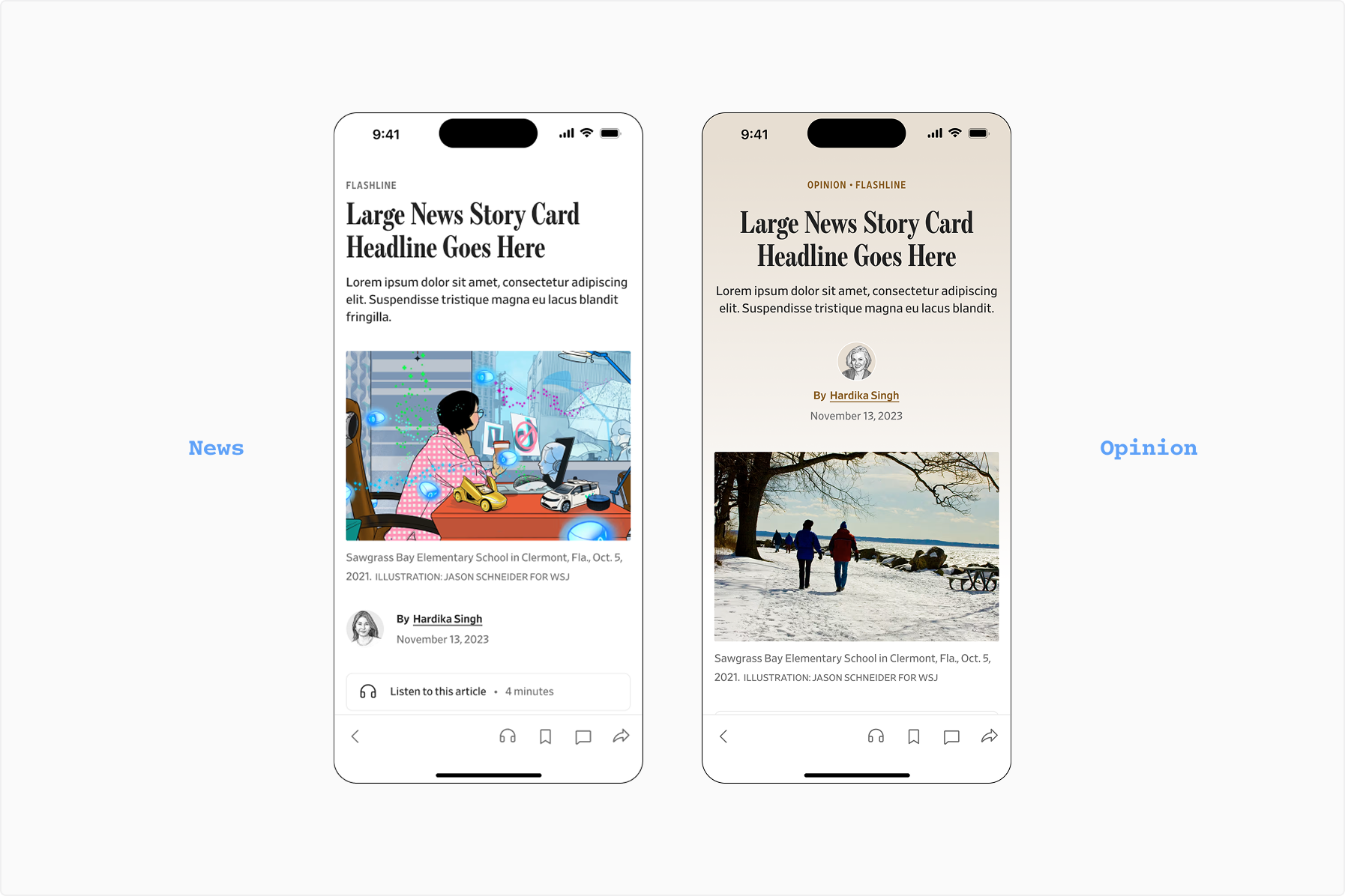
Article Header
We developed a journalism-first approach to the article header. Our design prioritizes clarity by removing barriers to information. The product should amplify the reporting, not compete with it. In collaboration with IDEO.
Absorbing vs Acting
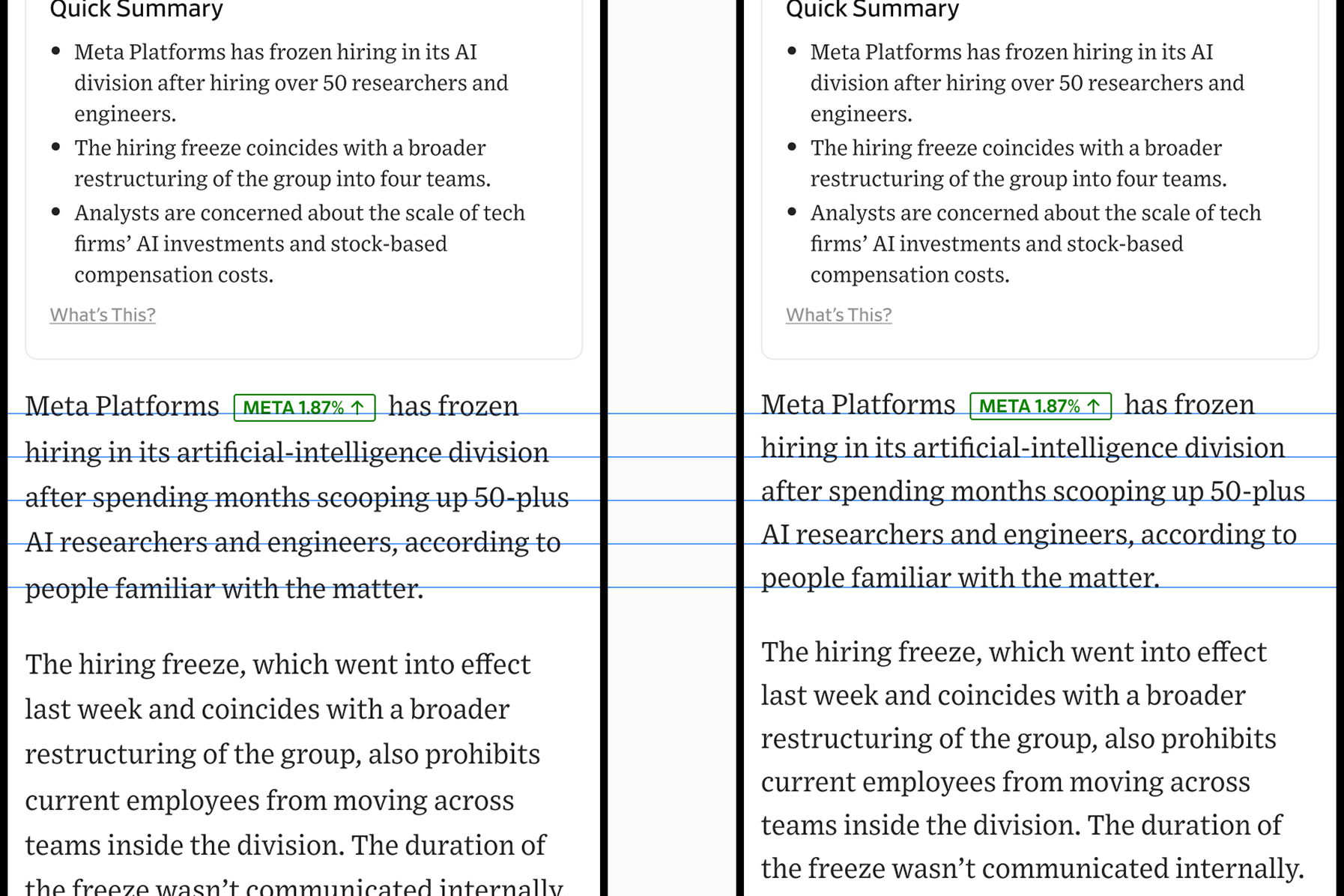
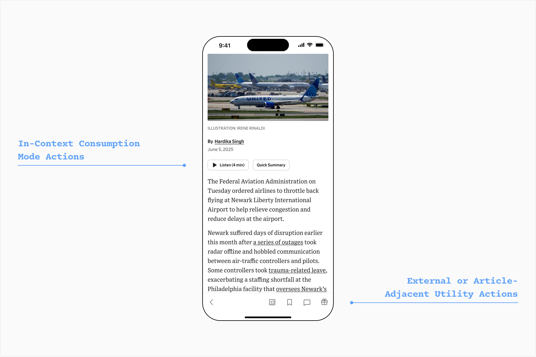
We clarified the distinction between features that deepen consumption and features that support action. Read-to-Me and Quick Summary remained in the reading flow, while save, share, gifting, and other utilities lived in a more intentional action layer. The result was a clarified surface for the journalism and a clean affordance center for actions the user might take that treats the article as an object.
Sharp Reading, No Paper Cuts
DESIGN
Typography
We optimized the article typography for clarity. Tightening line height reduced the floaty feel of the page while better aligning with accessibility standards and creating a denser, more premium reading experience.